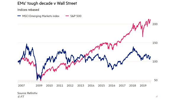
S&P 500 vs. MSCI Emerging Markets Index

S&P 500 vs. MSCI Emerging Markets Index This chart shows the strong performance of the S&P 500 against the MSCI Emerging Markets Index. Image: Financial Times

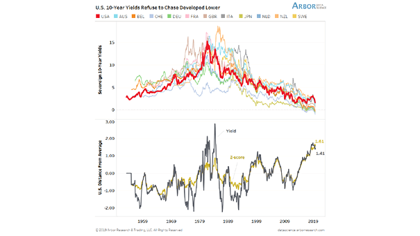
U.S. 10-Year Yields

U.S. 10-Year Yields U.S. 10-year yields are currently 140 bps above developed peers and highest since 1984. Image: Arbor Research & Trading

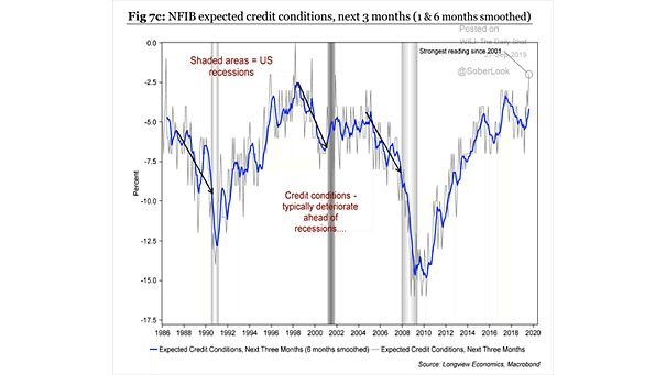
NFIB Expected Credit Conditions

NFIB Expected Credit Conditions NFIB Expected Credit Conditions are improving and suggest that the U.S. expansion still has room to run. Source: Longview Economics

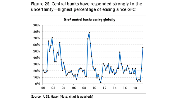
Percentage of Central Banks Easing Globally

Percentage of Central Banks Easing Globally Currently, most of the world’s central banks are easing: 55% is the highest percentage since the global financial crisis. Image: UBS

Distributions of Volatility by Countries

Distributions of Volatility by Countries This chart shows the average of 6-month rolling standard deviation of monthly returns over the last 10 years. Image: J.P. Morgan

U.S. Debt and Demographics

U.S. Debt and Demographics This interesting chart clearly shows the large divergence between U.S. debt and demographics. Image: Fidelity Investments

S&P 500 Buyback Index vs. S&P 500 Total Return Index

S&P 500 Buyback Index vs. S&P 500 Total Return Index This chart clearly shows the large divergence between the S&P 500 Buyback Index and the S&P 500 Total Return Index. Image: Real Investment Advice

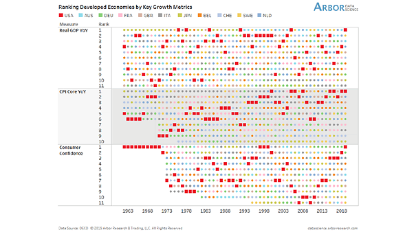
U.S. Economy and U.S. 10-Year Yield

U.S. Economy and U.S. 10-Year Yield This chart suggests that the U.S. economy’s percentile relative to developed countries explains the U.S. 10-year yield. Image: Arbor Research & Trading LLC