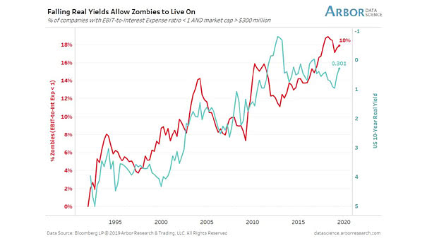
S&P 500 – Price vs. Dividends

S&P 500 – Price vs. Dividends What happens to dividends when there’s a market collapse? This interesting chart shows that dividends don’t fall as much as stocks. Image: A Wealth of Common Sense

Earnings Growth and the Fed Cycle

Earnings Growth and the Fed Cycle Analysts remain optimistic on 2020. This chart shows the expected earnings growth over the next 12 months. Image: Fidelity Investments

China Real GDP Growth Projection

China Real GDP Growth Projection Real GDP growth in China is expected to continue to decline significantly in the coming years, with consumption becoming the main driver of growth. You may also like “Contribution of…

U.S. Active vs. Passive Fund Net Flows

U.S. Active vs. Passive Fund Net Flows Active mutual funds exhibit persistent outflows, while inflows into index-tracking U.S. mutual funds and ETFs continue to rise. Image: Bloomberg

U.S. 10-Year/2-Year Yield Curve and Recession

U.S. 10-Year/2-Year Yield Curve and Recession After the first Fed rate cut, a steepening of the U.S. 2-Year/10-Year spread could suggest a recession is coming. Image: UBS

Spread Between 10-ROC of S&P 500 and Treasury Bonds

Spread Between 10-ROC of S&P 500 and Treasury Bonds This interesting chart shows a 10 trading day rate-of-change (ROC) for the SP500 and for near-month Treasury bond futures prices. A price low is forming now.…

Trump Tweets About the Fed

Trump Tweets About the Fed The last trade escalation was also preceded by a flurry tweets from President Trump attacking the Fed. Image: Deutsche Bank