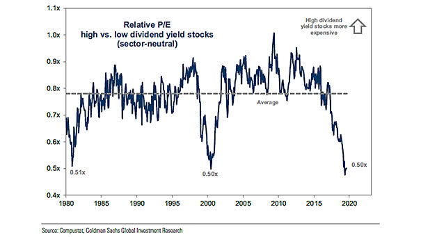
Valuation Gap Between High and Low Dividend Yield Stocks
Valuation Gap Between High and Low Dividend Yield Stocks This chart shows that the valuation gap between high and low dividend yield stocks is almost the widest ever. Image: Goldman Sachs Global Investment Research