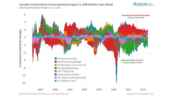
Demographics – Forecasting U.S. GDP
Demographics – Forecasting U.S. GDP This chart suggests that aging population is weighing down growth. Image: Arbor Research & Trading LLC
Demographics – Forecasting U.S. GDP This chart suggests that aging population is weighing down growth. Image: Arbor Research & Trading LLC
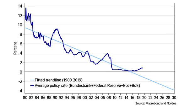
G4 Central Banks Monetary Policy Rate If the trend in G4 central banks monetary policy rates continues, this chart suggests that we could see -4% in 2030. Image: Nordea and Macrobond
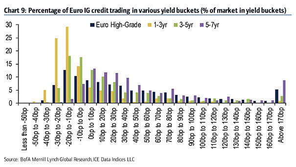
Percentage of Euro IG Credit Trading in Various Yield Buckets and Negative Yields This chart is another example of negative-yielding debt, which poses major risks for investors. Image: BofA Merrill Lynch
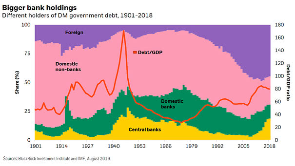
Different Holders of DM Government Debt The chart shows the historical breakdown of different holders of DM government bonds and overall DM debt-to-GDP. Even with QE, central bank government bond holdings are below historical peaks.…
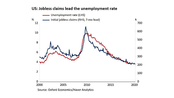
U.S. Jobless Claims Lead the Unemployment Rate This chart suggests that U.S. jobless claims lead the unemployment rate by 7 months. U.S. initial claims for unemployment fall more than expected to 209,000. Image: Oxford Economics
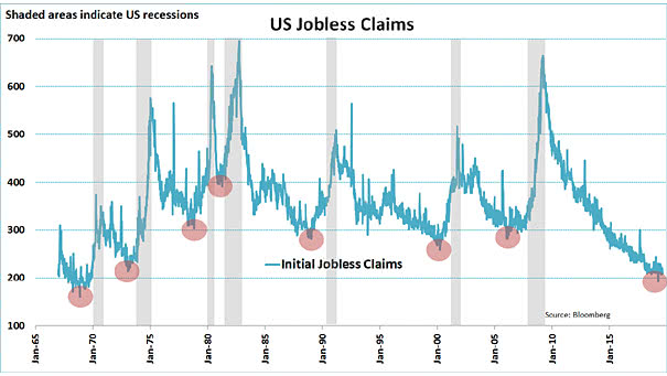
U.S. Jobless Claims and Recessions Before a recession, U.S. initial jobless claims bottomed. Image: Jeroen Blokland
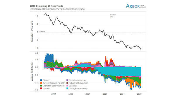
Germany – Explaining 10-Year Bund Yields This great chart suggests that demographics explain Germany’s 10-year bund yields. An R² of 0.87 is quite high and significant. Image: Arbor Research & Trading LLC
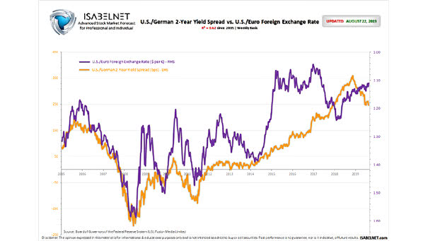
U.S./German 2-Year Yield Spread vs. U.S./Euro Foreign Exchange Rate This chart shows the Euro vs. US Dollar (EUR/USD) and how a wider U.S./German 2-year yield spread corresponds to a stronger US dollar. R² = 0.62…
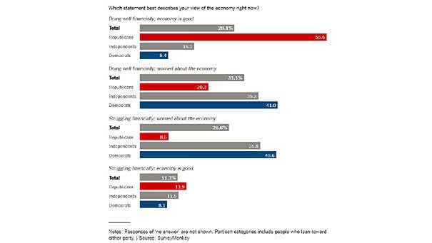
Democrats, Republicans, Independents – View of the Economy Americans are showing some doubts about the economy, but Democrats are more concerned than Republicans. Image: The New York Times
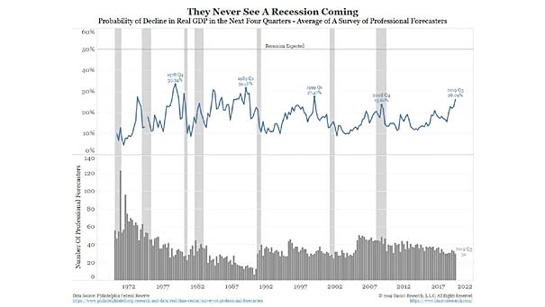
Economists Never See A Recession Coming This chart shows that economists are not good at predicting U.S. recessions. Image: Bianco Research
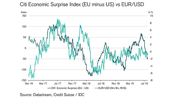
Citi Economic Surprise Index vs. EUR/USD Weaker European growth relative to the U.S. could weaken Euro/U.S. Dollar. Image: Credit Suisse