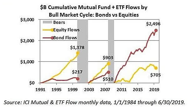
OCDE World Leading Indicator vs. Global GDP Growth
OCDE World Leading Indicator vs. Global GDP Growth The OCDE world leading indicator suggests a weakness in global GDP growth. Image: Jeroen Blokland
S&P 500 Operating Earnings / NIPA Profits and S&P 500 Returns Interesting chart suggesting that S&P500 2-year returns will be negative, as they were in the late 1990s, when S&P 500 operating earnings rose relative…
When Treasury Inflation-Protected Securities (TIPS) Outperform? The chart shows that Treasury Inflation-Protected Securities (TIPS) usually outperform regular Treasuries when the 10-year breakeven inflation rate is below 2%. The 10-year breakeven inflation rate is a market-based measure…
ISM Manufacturing Index Surrounding FED Easing Cycles The chart shows that the trend of the ISM Manufacturing Index is quite similar to past cycles before first Fed rate cut. Image: Deutsche Bank
Conference Board U.S. LEI and 6-Month S&P 500 Forward Return A Fed rate cut is good for the S&P 500 when the Conference Board U.S. LEI is positive. Image: Fundstrat Global Advisors, LLC
U.S. Treasury Yields and Inflation Expectations Interesting chart showing the correlation between U.S. Treasury yields and inflation expectations. Image: Foundation Alpha LLC.
Valuation and Demographics Our world is aging with high levels of debt and low interest rates, maybe for a long time. The chart shows that an aging population affects yields. You may also like “Debt…
U.S. Core PCE vs. Fed Target The U.S. core personal consumption expenditures price index, which excludes food and energy, rises to 1.6% in June. Inflation trending back up toward the Fed’s 2% target is good…
U.S. Equities – One Year Return After a Fed Rate Cut The chart shows how U.S. equities have historically performed after a 25 bps and 50 bps Fed rate cut over the last 35 years.…
Gold vs. Real U.S. Rates The chart shows the nice correlation between real U.S. rates (inverted) and the price of gold as a defensive asset. Image: Richardson Wealth
S&P 500 and Bloomberg Barclays U.S. Corporate High Yield Index The chart shows that the S&P 500 and high-yield bonds tend to go up and down together. Keep in mind that historically, the correlation between…