Unicorn’s Performance After Their IPOs
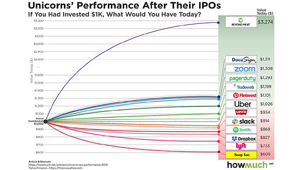
Unicorn’s Performance After Their IPOs A unicorn is a privately held startup company with a value of over $1 billion. The chart below shows the value today, if you had invested $1000 at the time…
Unicorn’s Performance After Their IPOs A unicorn is a privately held startup company with a value of over $1 billion. The chart below shows the value today, if you had invested $1000 at the time…
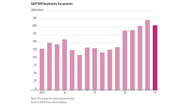
S&P 500 Share Buybacks by Quarter Share buybacks have contracted for the first time since 2017, as trade tensions and economic slowdown worry U.S. firms. Image: The Wall Street Journal

Global Bond Market This chart shows the growing global “bond bubble.” Since 2000, the global bond market has tripled in size. Image: J.P. Morgan Asset Management
S&P 500 Sector Returns: Dividends vs. Capital Appreciation Great chart showing the S&P 500 sector returns over the last 25 years. Image: J.P. Morgan Asset Management
U.S. Bond ETFs Top Inflows Record In June, investors significantly increased their exposure to bond funds, as weak economic data fuels slowdown worries. U.S. bond ETFs inflows hit $25.4bn. Image: Financial Times
Longest Economic Expansion in U.S. History Since the Great Recession, the U.S. economy has grown for 121 consecutive months. This is the longest economic expansion in American history. You may also like “Strength of Economic…
Before the Next FOMC Meeting, the Fed Funds Market Is Pretty Accurate Probability of a Fed rate cut on July 31, 2019: 100% (Fed funds market expectation). Image: Bianco Research
Conference Board Consumer Confidence Index vs. University of Michigan Consumer Sentiment Index History tells us that before a recession, the consumer confidence vs. sentiment spread always peaks and then declines. Image: Crescat Capital LLC
Gold is Uncorrelated to World Equity Since 1988, the correlation between gold and world equity has been only 3%. The 10-year rolling correlation has been between -10% and 10% over the past 20 years. Image:…
Best First Half for U.S. Equities and U.S. Bonds since 1995 Since 1995, it is the best first half for U.S. equities and U.S. long bonds, despite the challenge of low bond yields. Image: Financial…
Dow Jones Transportation Average vs. S&P 500 This interesting chart suggests that the Dow Jones Transportation Average underperforms in secular bull markets. Actually, the S&P 500 had higher returns when the Dow Jones Transportation Average…