U.S. Industrial Production YoY by Segment since 2013
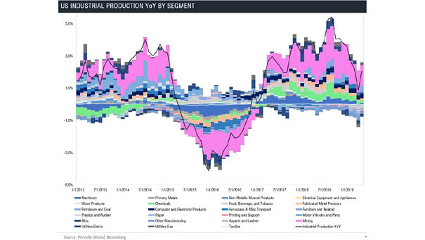
U.S. Industrial Production YoY by Segment since 2013 Another excellent chart showing the U.S. industrial production by segment. Image: Pervalle Global
U.S. Industrial Production YoY by Segment since 2013 Another excellent chart showing the U.S. industrial production by segment. Image: Pervalle Global

Just a Normal Day… “Just a normal day at the nation’s most important financial institution…” Image: Kevin “Kal” Kallaugher
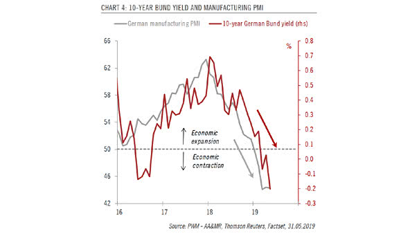
10-Year German Bund Yield and German Manufacturing PMI The 10-year German Bund yield could go positive again as recession fears dissipate. Image: Pictet Wealth Management
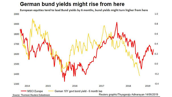
European Equities Lead Bund Yields by 6 Months Because European equities tend to lead bund yields by 6 months, bund yields should turn higher. Image: Reuters
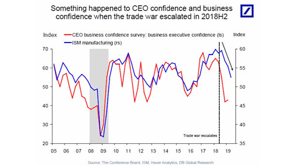
CEO Confidence & Business Confidence Deutsche Bank points out that something happened to CEO confidence and business confidence when the trade war escalated in 2018H2. Image: Deutsche Bank Global Research
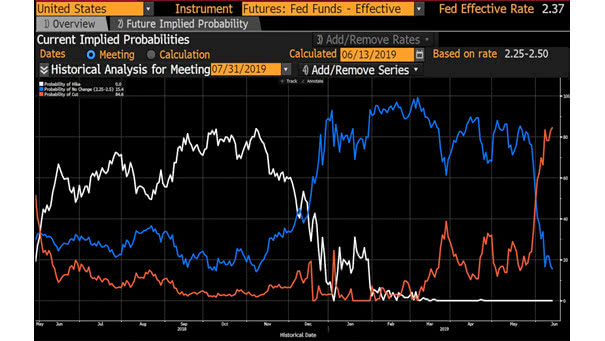
What is the Biggest Risk Right Now for Investors? What is the Biggest Risk Right Now for Investors? The risk of a Fed policy error The probability of a Fed rate cut in July 2019…
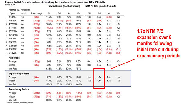
Initial Fed Rate Cuts and Resulting Forward Market Returns This spreadsheet also shows that the S&P 500 has performed well on average, around first Fed rate cut. Image: Fundstrat Global Advisors, LLC
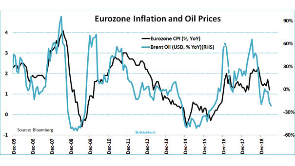
Eurozone Inflation and Brent Oil Prices This interesting chart shows the direct effect of brent oil prices (YoY % change) on euro area inflation. Image: Jeroen Blokland
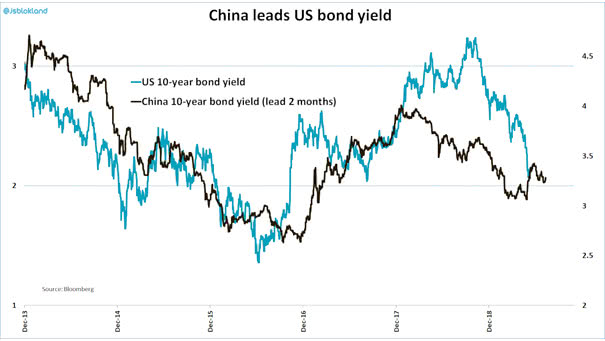
China 10-Year Bond Yield Leads US 10-Year Bond Yield This interesting chart shows that China 10-year bond yield tends to lead the U.S. 10-year bond yield by two months. Image: Jeroen Blokland
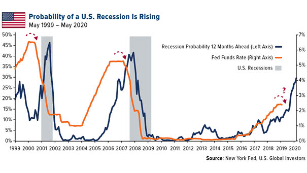
Probability of US Recession is Rising Mike Wilson, chief U.S. equity strategist for Morgan Stanley, said that “Fed could cut as soon as July but it may not halt slowdown/recession.” Image: U.S. Global Investors
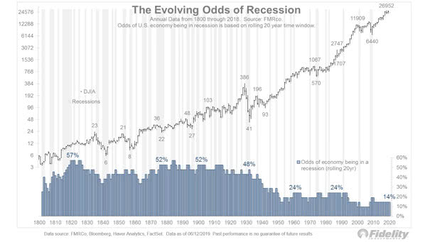
U.S. Recessions since 1800 This interesting chart shows that U.S. recessions are becoming rarer over time. The last U.S. recession began in December 2007 and ended in June 2009. Image: Fidelity Investments