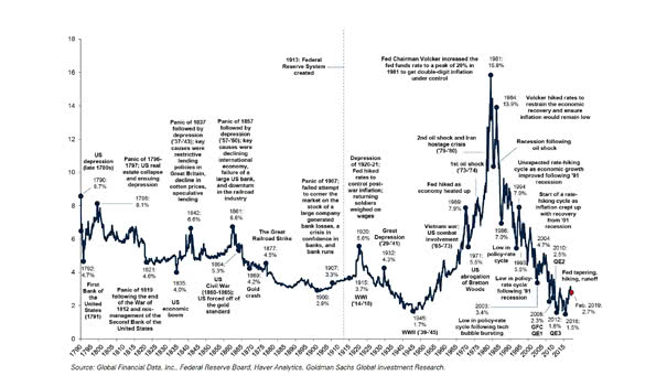
More than 200 Years of US Interest Rates in One Chart

More than 200 Years of U.S. Interest Rates in One Chart This long term chart covers more than two centuries of US interest rates (yield on the U.S. 10-year Treasury). Image: Goldman Sachs Global Investment…
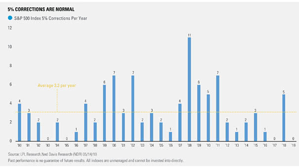
S&P 500 Index – Number of 5% Corrections Per Year

S&P 500 Index – Number of 5% Corrections Per Year Since 1990, there has been an average of 3.3 separate 5% declines for the S&P 500 per year. In a late business cycle, volatility increases.…

The Progression of World GDP

The Progression of World GDP This chart shows the percentage of world GDP by major countries/regions and how China’s GDP has risen steadily over the past few decades. Image: Bank of America Merrill Lynch

91.2% Correlation Between Gold Price and U.S. National Debt

91.2% Correlation Between Gold Price and U.S. National Debt According to the National Inflation Association, there’s 91.2% correlation between gold price and U.S. national debt. The U.S. government’s public debt is now more than $22…

Gold Has Crushed the S&P 500 So Far Since 2000

Gold Has Crushed the S&P 500 So Far Since 2000 Gold has returned a great 345.30 percent, while the S&P 500 has returned 146.57 percent since 2000. Keep in mind that Gold has beaten the…

Investor Movement Index vs. S&P 500

Investor Movement Index vs. S&P 500 The Investor Movement Index indicates the sentiment of TD Ameritrade retail investors. Thus, retail investors are net buyers of equities when the stock market is expensive, and they are net sellers…