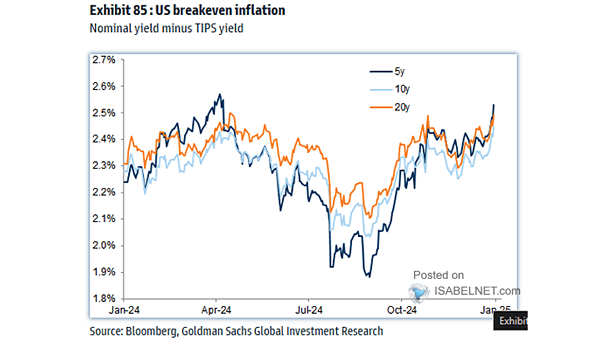
S&P 500 Index Max Pullback per Calendar Year

S&P 500 Index Max Pullback per Calendar Year Markets are never a straight ride up. Since 1980, the S&P 500 has averaged double‑digit gains while dropping roughly 14% each year. Volatility is simply the cost of long-term reward. Image: Carson Investment Research

Fed Funds Rate

Fed Funds Rate Markets are now pricing in a meaningful chance of a Fed rate hike in 2026, something that looked very unlikely at the start of the year. Image: MarketDesk Research

U.S. Unemployment Rate and Recessions

U.S. Unemployment Rate and Recessions The unemployment rate moving above its three-year average has preceded every U.S. recession since 1950. The latest crossover came in June 2024. Since then, no recession has followed, raising questions if this time is different. Image: Real Investment Advice

S&P 500 Returns After Down >15% YTD and Comes Back to Up Double Digits

S&P 500 Returns After Down >15% YTD and Comes Back to Up Double Digits History favors the bulls. Every time the S&P 500 has dropped more than 15% in a year and then roared back with double‑digit gains, the next year also posted double‑digit returns, without exception since 1950. Image: Carson Investment Research

Average S&P 500 Performance After Oil Shocks

Average S&P 500 Performance After Oil Shocks On average, U.S. equities have tended to be under pressure in the months following major oil shocks, though the pattern is not uniform and depends heavily on whether the shock is large, persistent, and tied to broader macro stress. Image: Deutsche Bank

Probability of U.S. Recession Calculated from the Yield Curve

Probability of U.S. Recession Calculated from the Yield Curve The probability of U.S. recession in 12 months, calculated from the yield curve, stands at 14.5%, tilting the narrative toward continued expansion. This cycle still has room to run. Image: Federal Reserve Bank of Cleveland

Cash Allocation by Non-Bank Investors Globally

Cash Allocation by Non-Bank Investors Globally Non‑bank global investors are rotating out of stocks and bonds and into cash as the Middle East conflict‑related energy shock raises inflation fears and the risk of higher interest rates. Image: J.P. Morgan

S&P 500 CAPE Ratio vs. U.S. Households Holding of Equities % Total Financial Assets

S&P 500 CAPE Ratio vs. U.S. Households Holding of Equities % Total Financial Assets Americans are all-in on equities like never before. That speaks to booming wealth and bullish sentiment, but it also leaves portfolios more vulnerable to any valuation reset. The ride higher feels good, until it doesn’t. Image: Topdown Charts

Share of Global Market Capitalization

Share of Global Market Capitalization The U.S. accounts for only 4% of the world’s population, but it holds 62% of global equity value. Its innovation pipeline continues to pull in overseas capital. The simple truth: markets still move to a U.S. beat. Image: Goldman Sachs Global Investment Research

S&P 500 Index and BB to 10-Year Treasury Spread

S&P 500 Index and BB to 10-Year Treasury Spread Keeping an eye on the junk to Treasury bond spread can reveal how healthy the U.S. market really is, and where it might be going next. The bond market usually sends signals before stocks react. Image: Real Investment Advice