The European Central Bank (ECB) Balance Sheet
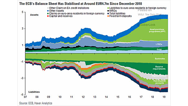
The European Central Bank (ECB) Balance Sheet Interesting chart showing the ECB balance sheet, component of the Eurosystem. Image: Goldman Sachs
The European Central Bank (ECB) Balance Sheet Interesting chart showing the ECB balance sheet, component of the Eurosystem. Image: Goldman Sachs
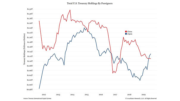
Total U.S. Treasury Holdings by Foreigners Japan and China are the two major foreign holders of U.S. Treasury securities. And currently, Japan surpasses China. Image: Bianco Research
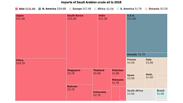
Imports of Saudi Arabian Crude Oil In 2018, the U.S. imported $21.9 billion of crude oil from Saudi Arabia. Image: The Washington Post
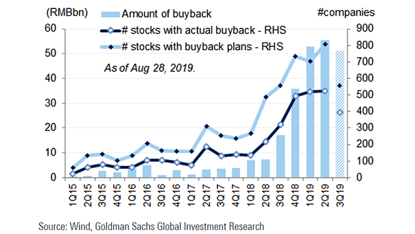
Share Buybacks in China Chinese companies are buying back record amounts of stocks. Image: Goldman Sachs Global Investment Research
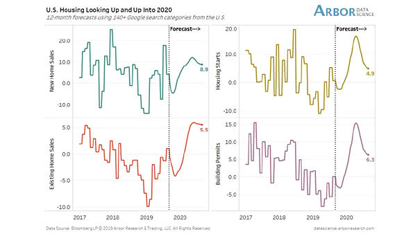
U.S. Housing Forecasts The 12-month forecast suggests that housing starts, building permits and home sales are on the rise. Image: Arbor Research & Trading LLC
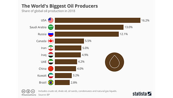
The World’s Biggest Oil Producers The U.S. is the first-largest producer of oil in the world, accounting for 16.2% of all production in 2018, and has surpassed Russia and Saudi Arabia. Image: Statista
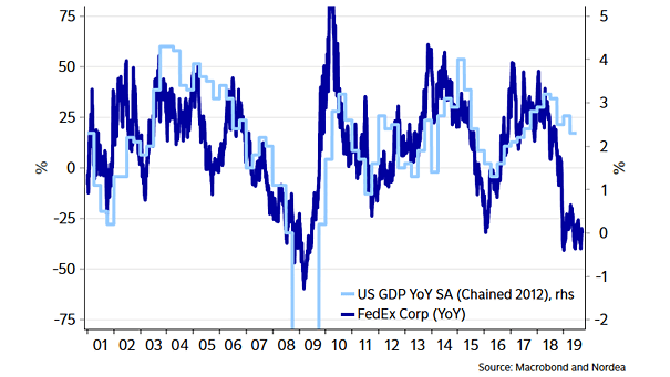
Fedex and U.S. GDP Interesting chart showing the pretty good correlation between FedEx and U.S. GDP. Image: Nordea and Macrobond
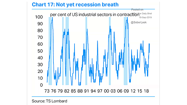
U.S. Industrial Sectors in Contraction Below Recession Levels Currently, the percentage of U.S. industrial sectors in contraction is below recession levels. Image: TS Lombard
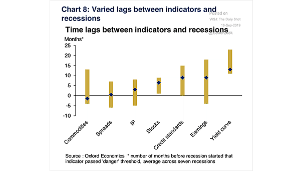
Time Lags Between Indicators and Recessions Chart showing that credit standards, earnings and the yield curve are the earliest recession indicators. Image: Oxford Economics

Global GDP and Brent Crude Oil Price High oil prices can cause recessions. Image: MarketWatch
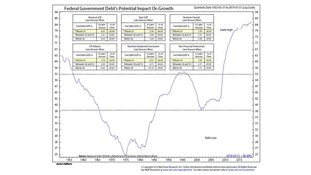
U.S. Federal Government Debt’s Potential Impact On Growth This chart puts the U.S. federal government debt’s potential impact on growth into perspective. Image: Ned Davis Research