Time Between Recent Yield Curve Inversions and Recessions
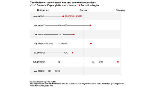
Time Between Recent Yield Curve Inversions and Recessions The U.S. 10-Year/3-Month yield spread has inverted before each of the past seven recessions. Image: Bloomberg
Time Between Recent Yield Curve Inversions and Recessions The U.S. 10-Year/3-Month yield spread has inverted before each of the past seven recessions. Image: Bloomberg
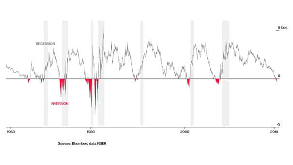
U.S. 10-Year/3-Month Yield Spread and Recessions This chart shows that inversions of the U.S. 10-Year/3-Month yield spread have preceded recent recessions Image: Bloomberg

Inequality: CEO Compensation vs. Typical Worker Compensation in the U.S. CEO compensation has grown 940% since 1978, while typical worker compensation has risen by only 12%. Image: Economic Policy Institute
S&P 500 Performance by President, from Reagan to Trump For President Trump, the stock market is a scorecard. This chart shows the S&P 500 performance across different presidencies, from Reagan to Trump. Image: Deutsche Bank
S&P 500 and the Shortest Maturity U.S. Treasury Yielded Highest Houston, we have a problem! Image: OddStats
U.S. GDP and S&P 500: Change in the Three Years After a Recession Began U.S. GDP has declined by about 1.4% over two quarters since World War II, and in the worst recessions, the S&P 500 has been cut in half. Image: The Washington Post
How Many Recessions People Lived Through As An Adult? This chart puts recessions into perspective. Currently, about 40 million American adults haven’t experienced a single recession during their working lives. Image: The Washington Post
Time From First 10Y-2Y Yield Curve Inversion And S&P 500 Returns The S&P 500 tends to rise after an inverted yield curve. Last three 10Y-2Y curve inversions, further gains average 33%. Image: Fundstrat Global Advisors, LLC
Global Semiconductor Sales Lead U.S. GDP Growth This interesting chart suggests that global semiconductor sales lead U.S. GDP growth by six months. Image: Nordea and Macrobond
U.S. Household Debt and World Trade This chart shows the pretty good correlation between U.S. household debt and world trade. Image: Oxford Economics, Macrobond
Real Annualized Equity Returns in Local Currency and U.S. Dollar Over a long period of time, this chart suggests that there is a small difference between local currency equity returns and U.S. dollar hedged returns. Image: Credit Suisse