Japan Corporate Profits Leads MSCI World EPS
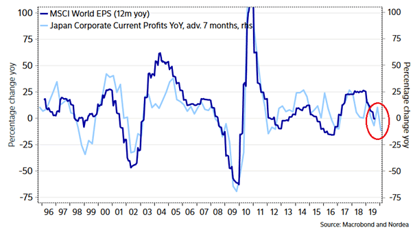
Japan Corporate Profits Leads MSCI World EPS This chart suggests that Japan corporate profits leads MSCI World EPS by 7 months. Image: Nordea and Macrobond
Japan Corporate Profits Leads MSCI World EPS This chart suggests that Japan corporate profits leads MSCI World EPS by 7 months. Image: Nordea and Macrobond
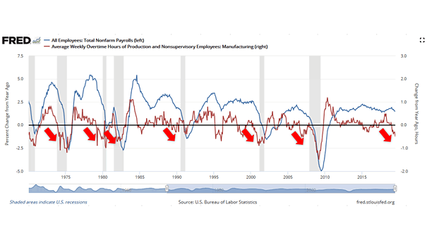
U.S. Nonfarm Payrolls vs. Overtime Hours and Recessions This chart shows that overtime hours are a leading indicator for where U.S. nonfarm payrolls might be headed, and generally turn negative prior to a recession.
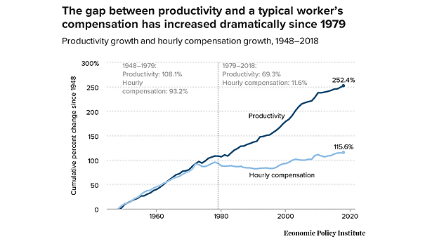
U.S. Productivity Growth and Hourly Compensation When wages lag behind productivity growth, workers do not receive their fair share of the wealth created. Image: Economic Policy Institute
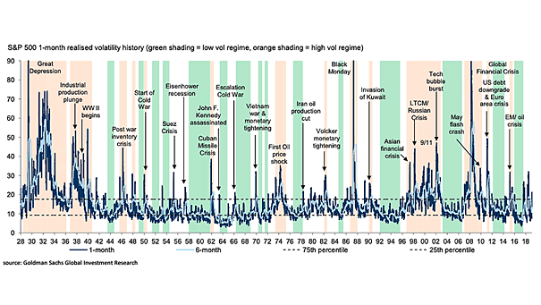
S&P 500 1-Month Realised Volatility History This chart shows that the last 90 years have been split equally between high, low and normal volatility regimes. Image: Goldman Sachs Global Investment Research
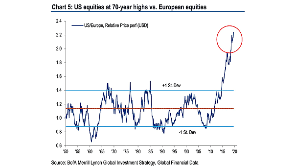
U.S. Equities at 70-Year Highs vs. European Equities Are European stocks more attractive than U.S. stocks? Currently, the euro area economy is more impacted by the global slowdown than the U.S. economy. And investors also think that the euro area economy is less resilient than the U.S. economy in the event of a shock. Image: BofA…
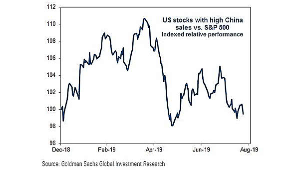
U.S. Stocks with High China Sales vs. S&P 500 US-China trade war affects the relative performance of U.S. stocks with high China sales vs. the S&P 500 index. Image: Goldman Sachs Global Investment Research
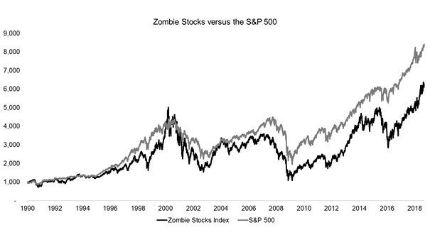
Zombie Companies – U.S. Zombie Stocks vs. S&P 500 Since 1990, an equal-weighted index of U.S. zombie stocks has not significantly underperformed the S&P 500. Image: FactorResearch
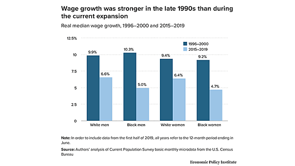
Weaker Wage Growth in the Current Expansion Interesting chart showing that wage growth is much weaker than it was in the late 1990s. Image: Economic Policy Institute
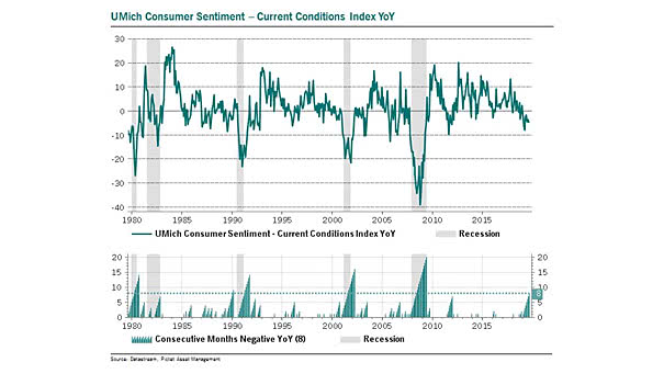
University of Michigan Consumer Sentiment Index – Current Conditions Index This index has been negative year-over-year for 8 consecutive months. This is rare outside of recession. Image: Pictet Asset Management
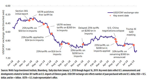
Chinese Yuan (USD/CNY) and Tariffs Trade-sensitive Chinese yuan could move lower with tariffs headlines. Image: Wells Fargo Investment Institute
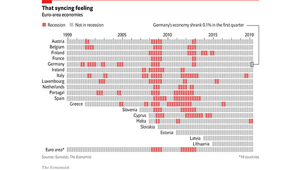
Fears of a German Recession Are Rising A recession in Germany could mean economic damage across the region. Image: The Economist