Conference Board U.S. LEI and 6-Month S&P 500 Forward Return
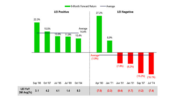
Conference Board U.S. LEI and 6-Month S&P 500 Forward Return A Fed rate cut is good for the S&P 500 when the Conference Board U.S. LEI is positive. Image: Fundstrat Global Advisors, LLC
Conference Board U.S. LEI and 6-Month S&P 500 Forward Return A Fed rate cut is good for the S&P 500 when the Conference Board U.S. LEI is positive. Image: Fundstrat Global Advisors, LLC
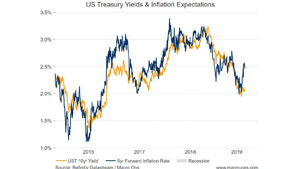
U.S. Treasury Yields and Inflation Expectations Interesting chart showing the correlation between U.S. Treasury yields and inflation expectations. Image: Foundation Alpha LLC.

Valuation and Demographics Our world is aging with high levels of debt and low interest rates, maybe for a long time. The chart shows that an aging population affects yields. You may also like “Debt and Demographics.” Image: Fidelity Investments
U.S. Core PCE vs. Fed Target The U.S. core personal consumption expenditures price index, which excludes food and energy, rises to 1.6% in June. Inflation trending back up toward the Fed’s 2% target is good news. You may also like “U.S. Core Inflation Expected Over the Next 21 Months.”
U.S. Equities – One Year Return After a Fed Rate Cut The chart shows how U.S. equities have historically performed after a 25 bps and 50 bps Fed rate cut over the last 35 years. You may also like “First Fed Rate Cut.” Image: Ycharts
Gold vs. Real U.S. Rates The chart shows the nice correlation between real U.S. rates (inverted) and the price of gold as a defensive asset. Image: Richardson Wealth
S&P 500 and Bloomberg Barclays U.S. Corporate High Yield Index The chart shows that the S&P 500 and high-yield bonds tend to go up and down together. Keep in mind that historically, the correlation between the S&P 500 and the Bloomberg Barclays U.S. Corporate High Yield Index is 91.7%. Image: First Pacific Advisors, LP
Target Probabilities at the Fed’s July 31 Meeting Today, traders see a 47.6% probability of a 25-bps rate cut and a 52.4% probability of a 50-bps rate cut at the Fed’s July 31 meeting. Image: CME Group
Growth/Value Stock Ratio Around First Rate Cut: Recession vs. No Recession After first Fed rate cut and no recession within the next 12 months, growth stocks should outperform value stocks. Image: LPL Research
S&P 500 Returns After Rate Cuts Near Highs Since 1980, the Fed has cut rates 17 times (S&P 500 within 2% of new highs). One year later, the S&P 500 was still higher. Image: Ryan Detrick, LPL Financial LLC
Temperature Changes Around The World This climate stripes graphic shows how average temperatures have risen since 1901. Image: Ed Hawkins/Reading University