U.S. Total Federal Debt to GDP
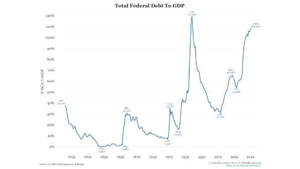
U.S. Total Federal Debt to GDP Another interesting chart showing the U.S. total federal debt to GDP since 1791. The current federal debt to GDP is near an all-time high. Image: Bianco Research
U.S. Total Federal Debt to GDP Another interesting chart showing the U.S. total federal debt to GDP since 1791. The current federal debt to GDP is near an all-time high. Image: Bianco Research
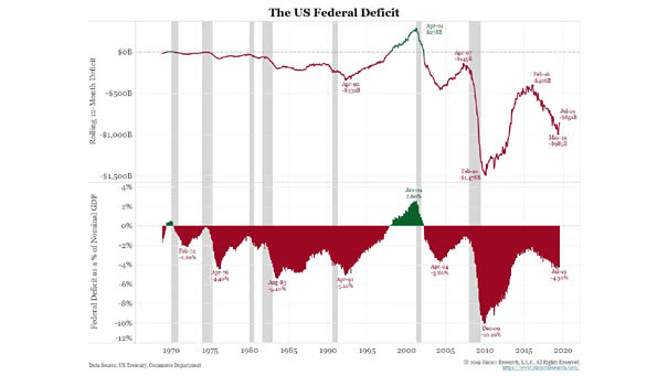
The U.S. Federal Deficit This chart shows how the U.S. federal deficit is skyrocketing. This is not a cause for panic… yet. Picture Source: Bianco Research

S&P 500 Index Returns After Fed Rate Cuts Near New Highs The adage of “don’t fight the Fed” may be too simplistic, but usually, the market doesn’t care too much about other things, as long as the Fed stays dovish. Image: LPL Research
Detecting and Measuring Asset Bubbles Detecting and measuring asset bubbles is not always an easy task. This chart puts into perspective the current U.S. households financial assets to GDP and the U.S. federal debt as percentage of GDP.
U.S. Recession Probabilities Over the Next Year from the Yield Curve Deutsche Bank has calculated the U.S. recession probabilities over the next year, using the slope of various yield curves. PCA (Principal Component Analysis) is used to estimate the effects of yield curve movements. Image: Deutsche Bank
World Population & Demographics – More People Over 65 than Under 5 for the First Time This chart suggests that declining fertility rates lead to an aging population and secular stagnation. Image: Deutsche Bank Global Research
Investor Allocation by Region in the U.S. This chart is a good example of investment bias and shows the likelihood of owning stocks in an industry vs. national average. Picture Source: J.P. Morgan Asset Management
S&P 500 and U.S. Economic Surprises This chart shows the current divergence between the S&P 500 YoY and the 12-month moving average of the U.S. economic surprise index. Image: Oxford Economics and Macrobond
Time, Diversification and the Volatility of Returns This chart shows how the volatility of returns decreases over time (range of equity, bond and blended total return). Picture Source: J.P. Morgan Asset Management
Divergence Between the 2-Year U.S. Treasury Yield and the U.S. Dollar Trump wants a weaker US dollar, but could the dollar weaken in the coming months? Image: Legg Mason
The Yield Curve Leads VIX (Volatility) by Three Years Is more volatility expected ahead? This chart suggests that the CBOE Volatility Index or VIX usually follows the U.S. 10-year vs. 3-month Treasury spread (inverted) with a 3-year lag. You may also like “VIX is in a Transitory State” and “Fed Funds Target Rate and VIX.”…