S&P 500 and U.S. Economic Surprises
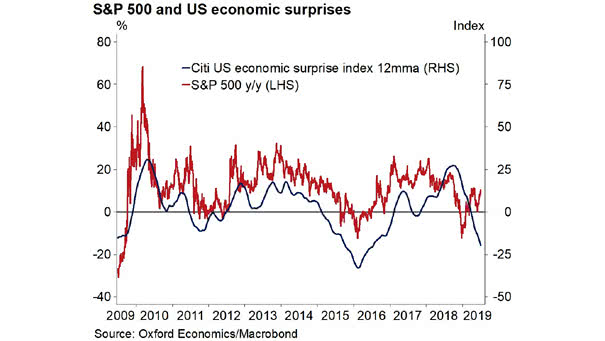
S&P 500 and U.S. Economic Surprises This chart shows the current divergence between the S&P 500 YoY and the 12-month moving average of the U.S. economic surprise index. Image: Oxford Economics and Macrobond
S&P 500 and U.S. Economic Surprises This chart shows the current divergence between the S&P 500 YoY and the 12-month moving average of the U.S. economic surprise index. Image: Oxford Economics and Macrobond
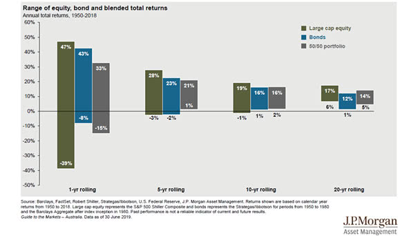
Time, Diversification and the Volatility of Returns This chart shows how the volatility of returns decreases over time (range of equity, bond and blended total return). Picture Source: J.P. Morgan Asset Management
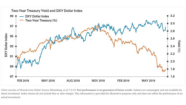
Divergence Between the 2-Year U.S. Treasury Yield and the U.S. Dollar Trump wants a weaker US dollar, but could the dollar weaken in the coming months? Image: Legg Mason
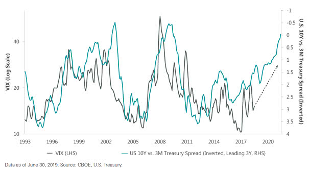
The Yield Curve Leads VIX (Volatility) by Three Years Is more volatility expected ahead? This chart suggests that the CBOE Volatility Index or VIX usually follows the U.S. 10-year vs. 3-month Treasury spread (inverted) with a 3-year lag. You may also like “VIX is in a Transitory State” and “Fed Funds Target Rate and VIX.”…
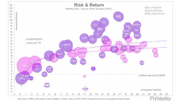
Risk and Return by Asset Class This interesting chart shows risk and return by asset class since 1970 and since 2009. Image: Fidelity Investments
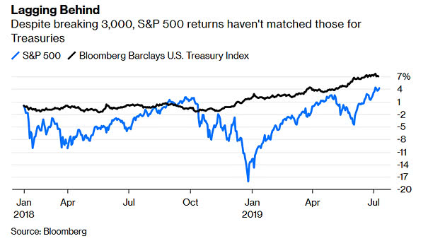
S&P 500 vs. U.S. Treasuries Despite its all-time high, the S&P 500 is below the Bloomberg Barclays U.S. Treasury Index. Picture Source: Bloomberg
“Our Greatest Weakness Lies In Giving Up…” –Thomas A. Edison Quote of the day: “Our greatest weakness lies in giving up. The most certain way to succeed is always to try just one more time.” –Thomas A. Edison
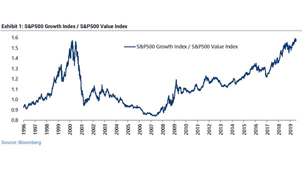
S&P 500 Growth Index / S&P 500 Value Index The Value vs. Growth differential has overshot the previous extreme at the height of the Dotcom bubble. You may also like “Will Value Ever Outperform Growth?” and “The Value vs. Growth Differential Has Never Been So Extreme.” Image: Bloomberg
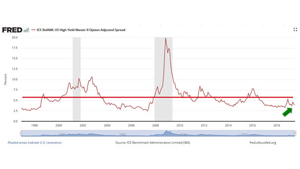
U.S. High-Yield Credit Spreads High-yield credit spreads are still below recession level (red line). A widening high-yield spread remains a useful indicator for predicting a coming recession in the current interest rate environment. You may also like “A Widening of Credit Spreads Is Very Useful to Predict a Recession“
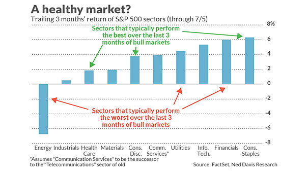
The Bull Market Has More to Run Sectors that typically perform the worst prior to market tops are holding up well. Image: MarketWatch
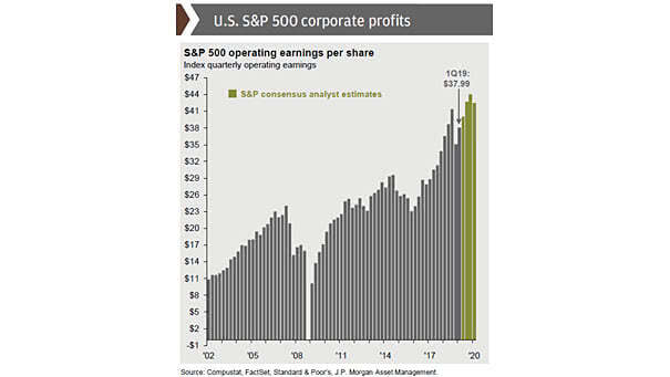
S&P 500 Operating Earnings per Share The S&P 500 quarterly operating earnings per share are Standard & Poors consensus analyst expectations as of 30 June 2019. Picture Source: J.P. Morgan Asset Management