S&P 500 Sector Returns: Dividends vs. Capital Appreciation
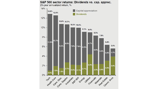
S&P 500 Sector Returns: Dividends vs. Capital Appreciation Great chart showing the S&P 500 sector returns over the last 25 years. Image: J.P. Morgan Asset Management
S&P 500 Sector Returns: Dividends vs. Capital Appreciation Great chart showing the S&P 500 sector returns over the last 25 years. Image: J.P. Morgan Asset Management
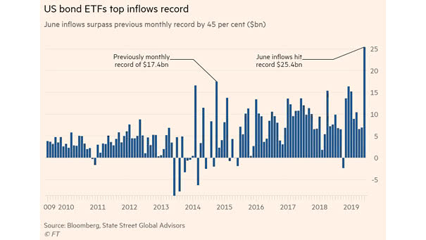
U.S. Bond ETFs Top Inflows Record In June, investors significantly increased their exposure to bond funds, as weak economic data fuels slowdown worries. U.S. bond ETFs inflows hit $25.4bn. Image: Financial Times
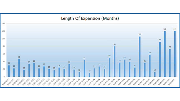
Longest Economic Expansion in U.S. History Since the Great Recession, the U.S. economy has grown for 121 consecutive months. This is the longest economic expansion in American history. You may also like “Strength of Economic Expansions.” Image: Ryan Detrick, LPL Financial LLC
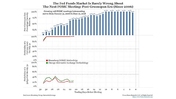
Before the Next FOMC Meeting, the Fed Funds Market Is Pretty Accurate Probability of a Fed rate cut on July 31, 2019: 100% (Fed funds market expectation). Image: Bianco Research
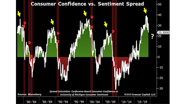
Conference Board Consumer Confidence Index vs. University of Michigan Consumer Sentiment Index History tells us that before a recession, the consumer confidence vs. sentiment spread always peaks and then declines. Image: Crescat Capital LLC
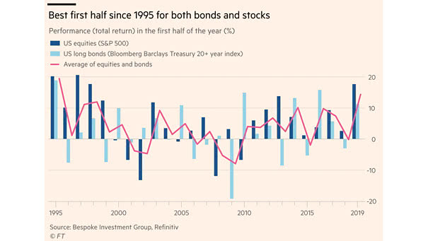
Best First Half for U.S. Equities and U.S. Bonds since 1995 Since 1995, it is the best first half for U.S. equities and U.S. long bonds, despite the challenge of low bond yields. Image: Financial Times
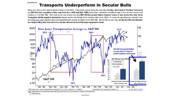
Dow Jones Transportation Average vs. S&P 500 This interesting chart suggests that the Dow Jones Transportation Average underperforms in secular bull markets. Actually, the S&P 500 had higher returns when the Dow Jones Transportation Average experienced negative momentum. Image: Oppenheimer & Co.
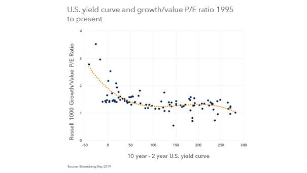
U.S. Yield Curve and Growth/Value P/E Ratio The chart below shows that the shape of yield curve explains nearly 50% of the variation in value vs. growth multiples. Actually, when the U.S. economy is sluggish, investors prefer growth stocks. Image: BlackRock, Inc.
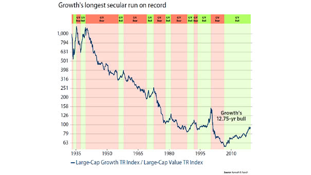
Will Value Ever Outperform Growth? When the U.S. economy is weak, investors prefer growth stocks. But value could outperform again, when the U.S. economy will be stronger. Image: Ned Davis Research
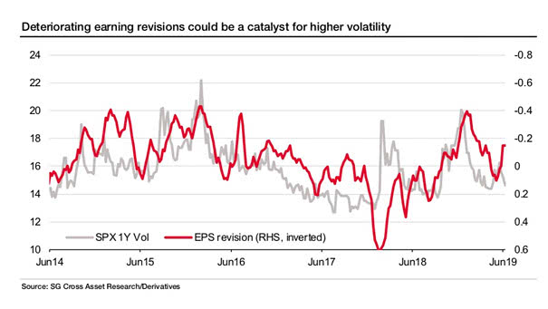
S&P 500 1-Year Volatility vs. EPS Revisions This chart from SG shows a good correlation between earning revisions and the S&P 500 1-year volatility. You may also like “S&P 500 1-Month Volatility History Since 1928 and VIX Since 1990.” Image: Societe Generale Cross Asset Research
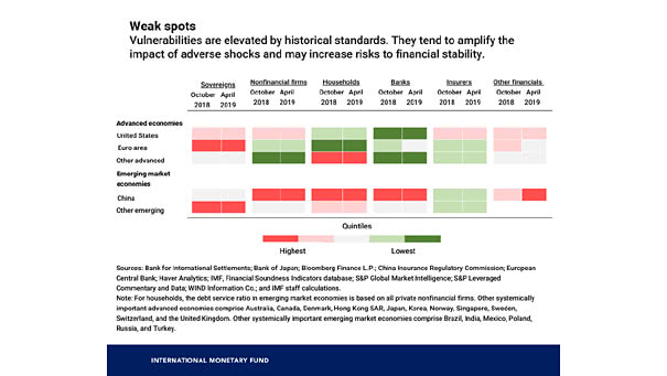
Warning Signs of the Next Financial Crisis Some vulnerabilities in the global economy pose a risk for investors and could amplify the next financial crisis. Image: International Monetary Fund