Performance of MSCI ACWI Around Global Health Emergencies
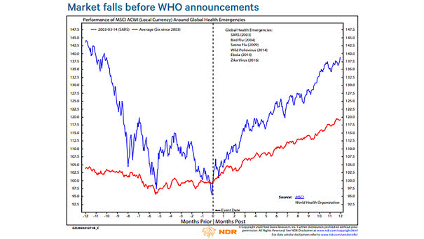
Performance of MSCI ACWI Around Global Health Emergencies Historically, the global stock market has bottomed, when the WHO has declared a global health emergency. Image: Ned Davis Research
Performance of MSCI ACWI Around Global Health Emergencies Historically, the global stock market has bottomed, when the WHO has declared a global health emergency. Image: Ned Davis Research
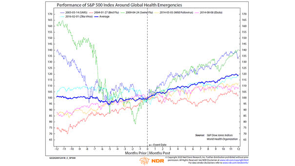
Performance of S&P 500 Index Around Global Health Emergencies Historically, market reactions to previous major health scares have shown short-term volatility, but no disruptions over an extended period of time. Image: Ned Davis Research

S&P 500 EPS Growth vs. Price Performance Chart showing the poor relationship between earnings growth and market performance, even in the long term. Image: BMO Capital Markets Investment Strategy Group
S&P 500 – Performance since 2016 vs. Performance since 2019 The U.S. stock market is on fire. Will history repeat itself? Image: Gavekal, Macrobond
S&P 500 Performance Leading to U.S. Election Date This table shows that over the last 20 election cycles in the U.S., there have been only two instances of market declines in the 12 months leading to the election results. Image: J.P. Morgan Asset Management
IPO Relative Performance in 2019 The IPO market is suffering in 2019. This year’s IPO class is one of the least profitable. Image: Goldman Sachs Global Investment Research
S&P 500 vs. MSCI Emerging Markets Index This chart shows the strong performance of the S&P 500 against the MSCI Emerging Markets Index. Image: Financial Times
Annual Performance of Gold and the S&P 500 since 1980 One of the advantages of gold is that it is uncorrelated to the U.S. stock market and provides diversification in a portfolio. Image: The Wall Street Journal
S&P 500 Performance by President, from Reagan to Trump For President Trump, the stock market is a scorecard. This chart shows the S&P 500 performance across different presidencies, from Reagan to Trump. Image: Deutsche Bank
First, Middle, Final Years of S&P 500 Bull Markets since 1975 The chart shows that the S&P 500 has generated a 26.9% return on average, in the final years of bull markets since 1975, excluding the current bull market. You may also like “Equity Market Performance Around Bear Markets.” Image: Legg Mason
Unicorn’s Performance After Their IPOs A unicorn is a privately held startup company with a value of over $1 billion. The chart below shows the value today, if you had invested $1000 at the time of the IPOs. You may also like “IPOs Tend to Underperform the Market.” Image: howmuch.net