Coronavirus vs. SARS
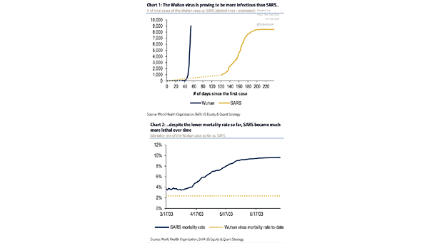
Coronavirus vs. SARS These two charts suggest that the coronavirus is less deadly but more infectious than SARS Image: BofA US Equity & Quant Strategy
Coronavirus vs. SARS These two charts suggest that the coronavirus is less deadly but more infectious than SARS Image: BofA US Equity & Quant Strategy
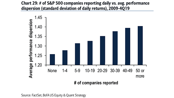
Volatility – Number of S&P 500 Companies Reporting Daily vs. Average Performance Dispersion As the number of earnings results increases, the higher the volatility of stock. Image: BofA US Equity & Quant Strategy

Valuation Expansion: Year-Over-Year Change in S&P 500 Forward P/E This chart suggests that investors shouldn’t expect valuation expansion this year. Image: BofA US Equity & Quant Strategy
Leverage – Net Debt to EBITDA of Small Caps vs. Large Caps Excess leverage is more pronounced among U.S. small caps. Image: BofA US Equity & Quant Strategy
Small Cap Cyclical Sectors vs. Defensive Sectors Median Forward P/E Relative valuations for small-cap cyclicals versus small-cap defensives also remain near the 20-year lows. Image: BofA US Equity & Quant Strategy
S&P 500 Total Return Decomposition by Sector Financials is the only sector that has experienced multiple contraction for the past decade. Image: BofA US Equity & Quant Strategy
S&P 500 Operating EPS vs. Normalized EPS The gap between operating and normalized EPS is the widest since Q3 2007 (the prior market peak). Image: BofA US Equity & Quant Strategy
BofA Sell Side Indicator The BofA’s Sell Side Indicator suggests no euphoria and equity returns of 12% over the next 12 months, putting the S&P 500 at 3,629 by year-end. Image: BofA Global Research US Equity & Quant Strategy
Momentum to Value Rotation The rotation into value suggests a rebound in global economic growth, not a recession. Image: BofA Merrill Lynch US Equity & US Quant Strategy
Multiple Expansion – Year-Over-Year Change in the S&P 500 Forward P/E Since the beginning of the year, the multiple expansion explains the S&P 500 return. Historically, S&P multiples contract or remain flat following years of big multiple expansion. Image: BofA Merrill Lynch US Equity & US Quant Strategy