Will Value Ever Outperform Growth?
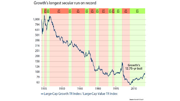
Will Value Ever Outperform Growth? When the U.S. economy is weak, investors prefer growth stocks. But value could outperform again, when the U.S. economy will be stronger. Image: Ned Davis Research
Will Value Ever Outperform Growth? When the U.S. economy is weak, investors prefer growth stocks. But value could outperform again, when the U.S. economy will be stronger. Image: Ned Davis Research
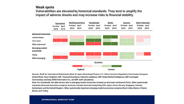
Warning Signs of the Next Financial Crisis Some vulnerabilities in the global economy pose a risk for investors and could amplify the next financial crisis. Image: International Monetary Fund

Value of U.S. Corporate Bonds by Rating Since the Great Recession, the U.S. corporate bond debt rated ‘BBB’ exceeds $3 trillion. If the U.S. economy goes wrong, this is bad news for investors. Image: The Wall Street Journal
S&P 500 Low Volatility Stocks Are the Best Performing Asset YTD This chart shows that S&P 500 low volatility stocks are the best performing asset year-to-date (outside of GSCI energy). Actually, high-quality stocks are a good way to protect against a weak economy. Image: Goldman Sachs Global Investment Research
S&P 500 at Risk of a 10% Correction If the U.S. economy continues to deteriorate, the S&P 500 Index could fall into a 10% correction in the third quarter, according to Morgan Stanley. Image: Bloomberg
Small Business Optimism Roars Back, Rivaling Historic Highs Small Business Optimism Index improved: expectations for sales, business conditions, and expansion rose. That’s good news for the U.S. economy. See why the “Small Businesses Optimism Index” is a good recession indicator. Image: National Federation of Independent Business (NFIB)
Could European Stocks Outperform U.S. Stocks? This chart shows U.S. vs. European stocks at 70-year highs. Keep in mind that investors think that the euro area economy is less resilient than the U.S. economy in the event of a shock. Currently, the euro area economy is more impacted by the global slowdown than the U.S.…
ISM Manufacturing vs. 10-Year Treasury Yields This chart shows a nice correlation between ISM manufacturing index and 10-year Treasury yields since 2010. This chart can explain why 10-year Treasury yields have fallen. PMI index above 50 percent indicates that the manufacturing economy is expanding, and a PMI index below 50 percent indicates that the manufacturing…
Market Reaction to Fed Insurance Cuts vs. Fed Recession Cuts This chart shows the S&P 500 and 10-year Treasury Note response to Fed insurance cuts vs. Fed recession cuts. There is a big difference for equities, but not too much for bonds. Image: Pictet Wealth Management
Cyclical Stocks Responding to Steepening Long-term Yield Curve Keep in mind that the Fed has little influence on the long end of the yield curve. And currently, the 30-year Treasury rate minus 10-year Treasury rate spread has a normal upward slope, like in the mid-1990s when the economy was growing. The chart below shows that the…