S&P 500 Post-Crisis Movement
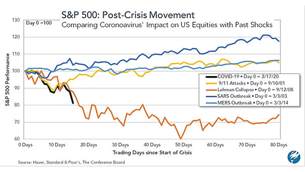
S&P 500 Post-Crisis Movement This chart compares the coronavirus impact on U.S. equities with past shocks. The impact looks more like the Lehman Brothers collapse. Image: The Conference Board
S&P 500 Post-Crisis Movement This chart compares the coronavirus impact on U.S. equities with past shocks. The impact looks more like the Lehman Brothers collapse. Image: The Conference Board
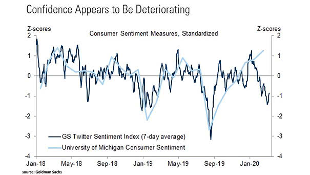
Twitter Sentiment Index and University of Michigan Consumer Sentiment The Goldman Sachs Twitter Sentiment Index suggests that U.S. consumer sentiment appears to be deteriorating. Image: Goldman Sachs Global Investment Research

S&P 500 and Key Fed Dates Chart showing that the U.S. stock market has been Fed driven in the past year. Image: Credit Suisse Research
S&P 500 and Global Money Supply Chart suggesting that global money supply tends to push U.S. equities higher. Image: Fidelity Investments
China Sales Exposure – Euro Stoxx 50 vs. S&P 500 Europe equities are more sensitive than the U.S. market, as the exposure of the Euro Stoxx 50 index to China is about twice that of the S&P 500. Image: Goldman Sachs Global Investment Research
The Countries Best and Worst Prepared for an Epidemic According to the 2019 Global Health Security Index, the U.S. has the greater level to respond to an epidemic or pandemic. Image: Statista
S&P 500 and Global M2 Liquidity This chart suggests that global M2 liquidity growth tends to push U.S. equities higher. Image: Nordea and Macrobond
% of S&P 500 Stocks with Dividends Yields Greater than the 10-Year Treasury Yield Dividend yields on S&P 500 stocks seem competitive vs. U.S. Treasuries, but equity risk does not disappear because a company pays a dividend. Image: Truist
Global Investment Research Financial Excess Monitor and Recessions The heat map suggests below-average imbalances in the U.S. economy. Image: Goldman Sachs Global Investment Research
S&P 500 Next Twelve Months P/E vs. Dollar Index This chart suggests that the strength of the U.S. dollar supports higher P/E multiples for the S&P 500. Image: Strategas