Productivity: How Productive is an Hour of Work?
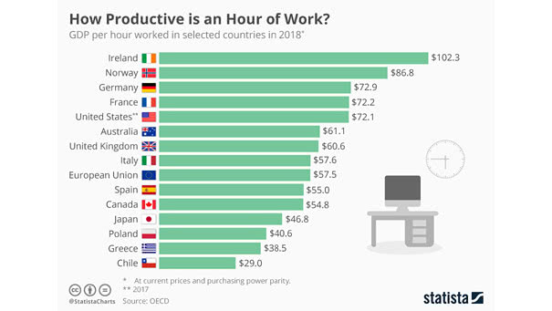
Productivity: How Productive is an Hour of Work? An hour’s work in Ireland contributes $102.3 to the economy, while in the U.S., this contribution is on average $72.1 Image: Statista
Productivity: How Productive is an Hour of Work? An hour’s work in Ireland contributes $102.3 to the economy, while in the U.S., this contribution is on average $72.1 Image: Statista
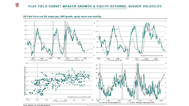
The Impact of an Inverted Yield Curve Great charts showing that a flat/inverted yield curve implies weaker U.S. GDP growth, lower equity returns, and higher volatility. Image: Pictet Asset Management

Federal Budget Deficit Since 1948 The federal budget deficit is unusually large compared to the state of the U.S. economy. Image: Goldman Sachs
Annual Performance of Gold and the S&P 500 since 1980 One of the advantages of gold is that it is uncorrelated to the U.S. stock market and provides diversification in a portfolio. Image: The Wall Street Journal
Time Between Recent Yield Curve Inversions and Recessions The U.S. 10-Year/3-Month yield spread has inverted before each of the past seven recessions. Image: Bloomberg
USA – Explaining 10-Year Yields This great chart suggests that demographics and globalization explain U.S. 10-year yields. Image: Arbor Research & Trading LLC
MOVE vs. Treasury Term Premium This chart shows the nice correlation between MOVE (implied volatility of U.S. Treasury markets) and the Treasury term premium. The term premium is the risk premium (or the bonus) that investors receive for the risk of owning longer-term bonds. Image: Longview Economics, Macrobond
GDP-Based Recession Indicator Index This index measures the probability that the U.S. economy was in a recession during the indicated quarter. In Q1 2019, the probability of recession was 2.90%. When this recession indicator exceeds 35% (red line), history tells us that the probability of recession is increasing.
The Trade War Effect on Crude Oil This chart shows Chinese imports of crude oil from U.S.. Image: Capital Economics
The Yield Curve Leads VIX (Volatility) by Three Years Is more volatility expected ahead? This chart suggests that the CBOE Volatility Index or VIX usually follows the U.S. 10-year vs. 2-year Treasury spread (inverted) with a 3-year lag. Image: Morgan Stanley Research