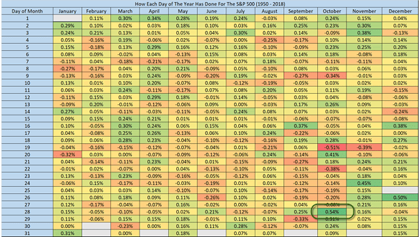
S&P 500 Average Return for Each Day

S&P 500 Average Return for Each Day This spreadsheet shows the S&P 500 average return for each day from 1950 to 2018. “History never repeats itself but it rhymes” –Mark Twain. October 28 has been historically the best day of the year for the S&P 500. You may also like “S&P 500 vs. Its Seasonal Pattern.” Image: Ryan…
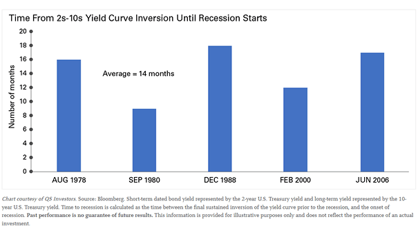
10Y-2Y Yield Curve Inversion Until U.S. Recession Starts

10Y-2Y Yield Curve Inversion Until U.S. Recession Starts An inverted yield curve doesn’t always mean that a recession is imminent. But historically, a sustained yield curve inversion has been a good indicator of recession. Image: Legg Mason

S&P 500 Value Index at All-Time High

S&P 500 Value Index at All-Time High Historically, when the S&P 500 Value Index made a new all-time high for the first time in 200+ days, it went higher 6 months later. Image: Sentimentrader

U.S. Composite Recession Probability

U.S. Composite Recession Probability How far is the U.S. recession? Currently, the Composite Recession Probability stands at 19.6%. Historically, the probability of recession increases, when the recession rate exceeds 30%. Image: BofA Merrill Lynch

Risk-Adjusted Returns Across the Treasury Strips Curve

Risk-Adjusted Returns Across the Treasury Strips Curve The distribution of strong returns across the Treasury curve has become very tight. Historically, this marks the beginning of the end. Image: Arbor Research & Trading LLC

U.S. Misery Index and Average Forward Returns

U.S. Misery Index and Average Forward Returns The U.S. misery index (core inflation + unemployment) is approaching all-time low, because both inflation and unemployment are very low. Historically, average forward returns have been higher than the overall S&P 500 average.

S&P 500 Tax Adjusted EPS vs. Trend

S&P 500 Tax Adjusted EPS vs. Trend Interesting chart showing that S&P 500 tax adjusted earnings are well above the trend in the United States, and have historically preceded earning plunges. Image: J.P. Morgan Asset Management

China and Taiwan Manufacturing PMI

China and Taiwan Manufacturing PMI The charts suggest a bottom in the Chinese and Taiwanese cycle in early 2020. Historically, this has been positive for global equities. Image: Danske Bank Research

Global Nominal GDP and Corporate Profits

Global Nominal GDP and Corporate Profits This chart shows the correlation and the slowdown in global growth and corporate profits. Historically, margin pressures have preceded the start of recessions. Image: J.P. Morgan

Housing – U.S. Construction Spending and Recessions

Housing – U.S. Construction Spending and Recessions Historically, when the three month moving average turned negative, a U.S. recession occurred within a 12-month period, 7 times out of 9. Image: Pictet Asset Management