Copper vs. China and Gold vs. U.S. Real Yields
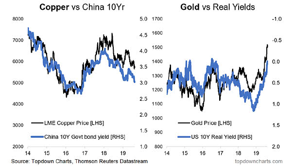
Copper vs. China and Gold vs. U.S. Real Yields Copper price is underperfoming gold, because China 10-year yields and U.S. real yields are falling. Image: Topdown Charts
Copper vs. China and Gold vs. U.S. Real Yields Copper price is underperfoming gold, because China 10-year yields and U.S. real yields are falling. Image: Topdown Charts
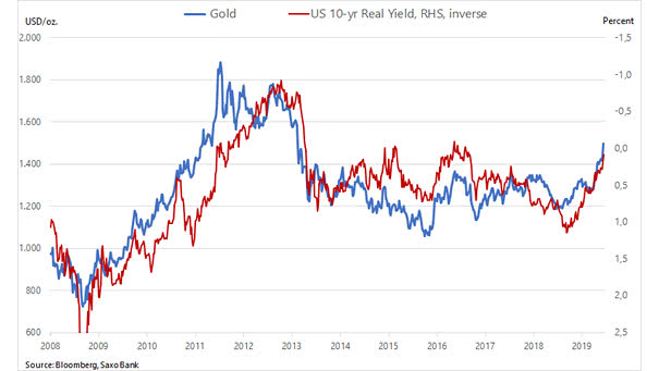
Gold vs. U.S. 10-Year Real Yield The chart shows the nice correlation between the U.S. 10-year real yield (inverted) and the price of gold as a defensive asset Image: Saxo Bank

Spread Between 10-ROC of S&P 500 and Treasury Bonds This interesting chart shows a 10 trading day rate-of-change (ROC) for the SP500 and for near-month Treasury bond futures prices. A price low is forming now. Image: McClellan Financial Publications, Inc.
U.S. Core PCE vs. Fed Target The U.S. core personal consumption expenditures price index, which excludes food and energy, rises to 1.6% in June. Inflation trending back up toward the Fed’s 2% target is good news. You may also like “U.S. Core Inflation Expected Over the Next 21 Months.”
Gold vs. Real U.S. Rates The chart shows the nice correlation between real U.S. rates (inverted) and the price of gold as a defensive asset. Image: Richardson Wealth
Homeownership Disparity Deepens Since 1994, the gap between blacks and whites has widened, in part because starter-home prices have exploded, year after year. Inequality: you may also like “U.S. Unemployment Rate: Black or African Americans” and “U.S. Net Worth by Wealth Bracket” and “Countries With the Highest Housing Bubble Risks.” Picture Source: Bloomberg
Countries With the Highest Housing Bubble Risks Detecting and measuring asset bubbles is not always an easy task, but in many countries, housing prices are rising faster than rental rates. Image: Visual Capitalist
U.S. Net Worth by Wealth Bracket Another chart showing the wealth disparities before and after the Great Recession. Inequality: you may also like “Lower Incomes Paid the Highest Price.” Image: Axios
History of the Real Federal Minimum Wage Today, the real federal minimum wage is worth 31% less than in 1968. It is also the longest period without an increase (adjusted for inflation). You may also like “Wage Growth vs. U.S. Home Price Growth.” Image: Economic Policy Institute
Labor Costs Lead Core Inflation by 6 Months Historically, U.S. labor costs have been a good leading indicator of core inflation, because when labor costs rise, companies tend to increase their prices. Image: Legg Mason