ISM Manufacturing Index vs. Philly Fed
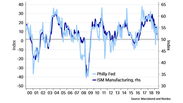
ISM Manufacturing Index vs. Philly Fed Today, the Philadelphia Federal Reserve Manufacturing Index at 21.8 suggests that the ISM Manufacturing Index should remain above 50. Image: Nordea and Macrobond
ISM Manufacturing Index vs. Philly Fed Today, the Philadelphia Federal Reserve Manufacturing Index at 21.8 suggests that the ISM Manufacturing Index should remain above 50. Image: Nordea and Macrobond
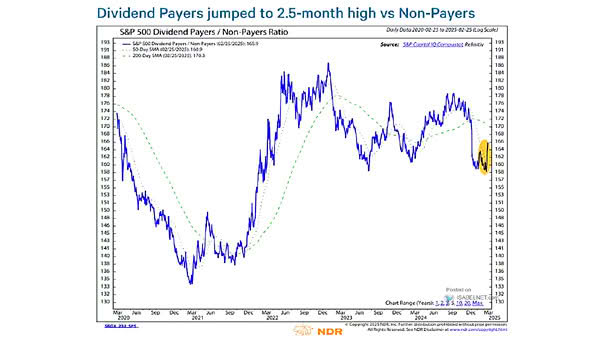
S&P 500 Dividend Payers / Non-Payers Around First Fed Rate Cut The chart shows that S&P 500 dividend payers have outperformed non-payers around the first Fed rate cut and 12 months later, because they are more attractive than bonds. Image: Ned Davis Research

S&P 500 and U.S. Economic Surprises This chart shows the current divergence between the S&P 500 YoY and the 12-month moving average of the U.S. economic surprise index. Image: Oxford Economics and Macrobond
Time, Diversification and the Volatility of Returns This chart shows how the volatility of returns decreases over time (range of equity, bond and blended total return). Picture Source: J.P. Morgan Asset Management
Correlation Between S&P 500 and U.S. Treasuries This chart shows the correlation between stocks and bonds, which could affect a balanced 60/40 portfolio. Image: Arbor Research & Trading LLC
S&P 500 Index vs. Global M1 Liquidity Another good correlation between the S&P 500 Index and global M1 liquidity, while the Fed plans to stop quantitative tightening. The money supply M1 is the amount of effective money in the economy. Image: Nordea and Macrobond
The World Has $13 Trillion of Debt With Negative Yields But there are still positive-yield bonds. Image: The Wall Street Journal
U.S. 10-Year Yields vs. Copper To Gold Ratio Great chart showing a strong correlation between U.S. 10-year yields and the copper to gold ratio. Image: Nordea and Macrobond
MSCI Emerging Markets Index vs. World Semiconductor Sales This great chart suggests that world semiconductor sales lead the MSCI emerging markets index by 3 months. Very interesting chart before investing in emerging market equities. Country weights of the MSCI Emerging Markets Index: 33% China, 13.02% Korea, 11.35% Taiwan. Image: Nordea and Macrobond
Global PMI vs. G10 Central Banks Rates Cut When Global PMI is weak, as is currently the case, G10 central banks have always cut rates. Image: Nordea and Macrobond
BBB Debt by Sector in the U.S. By sector in the U.S., financial institutions have the largest amount of ‘BBB’ debt: $744 billion. That’s 53% of investment-grade bonds in the United States. You may also like “The U.S. Corporate Bond Debt Rated ‘BBB’ Exceeds $3 trillion.” Image: S&P Global Fixed Income Research