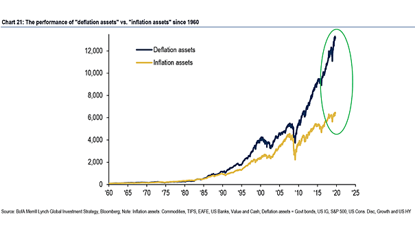
The Performance of “Deflation Assets” vs. “Inflation Assets”
The Performance of “Deflation Assets” vs. “Inflation Assets” Interesting chart showing the performance of “Deflation Asset” vs. “Inflation Assets” since 1960. “Deflation Assets”: Government Bonds, US Investment Grade, S&P 500, US Consumer Discretionary, Growth and US High Yield “Inflation Assets”: TIPS, EAFE, US Banks, Value and Cash Image: BofA Merrill Lynch