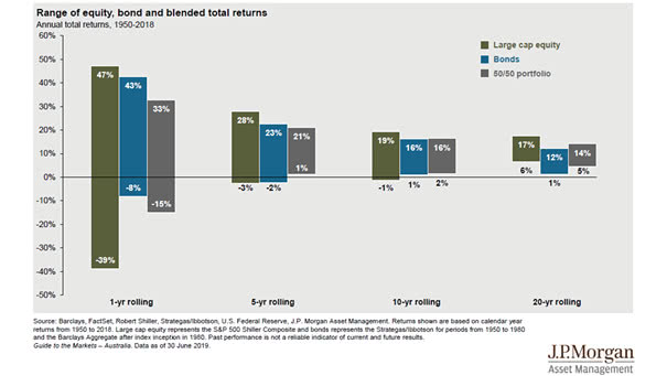
Time, Diversification and the Volatility of Returns
Time, Diversification and the Volatility of Returns This chart shows how the volatility of returns decreases over time (range of equity, bond and blended total return). Picture Source: J.P. Morgan Asset Management