Global Manufacturing vs. Service Sector
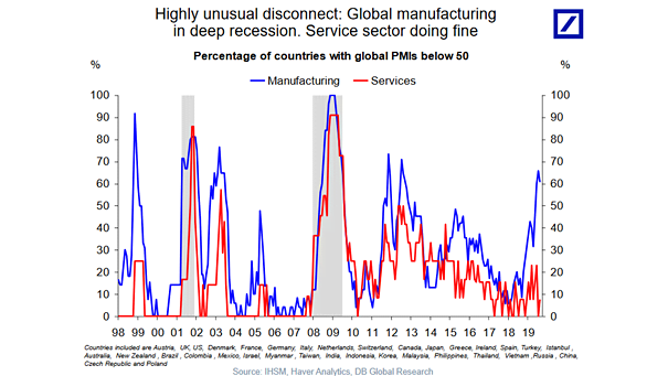
Global Manufacturing vs. Service Sector This chart shows that the global manufacturing sector is in recession, while the service sector is doing well. Image: Deutsche Bank Global Research
Global Manufacturing vs. Service Sector This chart shows that the global manufacturing sector is in recession, while the service sector is doing well. Image: Deutsche Bank Global Research
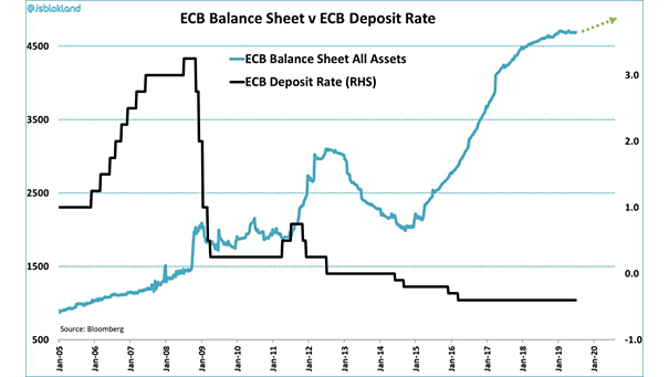
ECB Balance Sheet vs. ECB Deposit Rate It could be difficult to push rates further into negative territory without affecting the profitability and financing capacity of Eurozone banks. Image: Jeroen Blokland

U.S. Nonfarm Employment and NFIB Survey If the trade war continues, it will have serious negative repercussions on the American economy. Image: Deutsche Bank Global Research
Holders of Negative Yielding Debt Central banks hold 79% of negative-yielding debt. Image: Deutsche Bank Global Research
Gold in Real Terms Since 1960 Gold peaked on January 21, 1980 and would need to rise to $2,764/oz to make new peak. Image: Deutsche Bank Global Research
U.S. ISM Manufacturing Index and S&P 500 Cyclicals vs. Defensives Chart showing that U.S. cyclicals sectors relative to defensive sectors are still pricing in a strong rebound in growth (R = 0.82). Image: Deutsche Bank Global Research
U.S. ISM Manufacturing Index vs. S&P 500 Chart showing that the S&P 500 continues to price in a strong rebound in the ISM, from 49 to 54 (R = 0.62). Image: Deutsche Bank Global Research
Total Allocated Exchange Reserves by Currency The U.S. dollar represents 61% of all central bank foreign reserves. And the total value of all currencies held in foreign exchange reserves is almost $11 trillion. Image: howmuch.net
Buybacks Are the Source of the Rally in the Stock Market since 2009 But as trade tensions and economic slowdown worry U.S. firms, stock buybacks declined last quarter. Image: Deutsche Bank Global Research
Time from 2s-10s Yield Curve Inversion until Recession Starts Recession tends to start in one to three years after the yield curve inversion. The yield curve is only one indicator among others of an economic puzzle. Image: Deutsche Bank Global Research
U.S. Equity Volatility and Global Economic Policy Uncertainty The chart shows that U.S. equity volatility does not mirror global economic policy uncertainty since 2009, perhaps due to strong central bank support. Image: Pictet Wealth Management