A Hall of Mirrors in Monetary Policy?
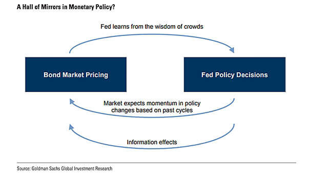
A Hall of Mirrors in Monetary Policy? This chart suggests a feedback loop between bond market pricing and central bank decisions. Image: Goldman Sachs Global Investment Research
A Hall of Mirrors in Monetary Policy? This chart suggests a feedback loop between bond market pricing and central bank decisions. Image: Goldman Sachs Global Investment Research
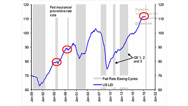
U.S. Leading Economic Indicators (LEI) and Fed Insurance Rate Cuts This chart shows that Fed insurance rate cuts can be good news when the U.S. economy slows down. Image: Scotiabank

S&P 500 Performance by President, from Reagan to Trump For President Trump, the stock market is a scorecard. This chart shows the S&P 500 performance across different presidencies, from Reagan to Trump. Image: Deutsche Bank
U.S. Yield Curve 18 Months Before Presidential Elections 18 months before presidential elections, a flatter yield curve suggests a greater tendency to predict a change away from the incumbent President’s party Image: Deutsche Bank
Gold vs. U.S. 10-Year Real Yield The chart shows the nice correlation between the U.S. 10-year real yield (inverted) and the price of gold as a defensive asset Image: Saxo Bank
Liquidity in U.S. Equity Futures Liquidity in U.S. equity futures collapsed in early 2018. It has remained at very low levels. The lack of liquidity could lead to violent market moves. Image: Deutsche Bank
Probability of US Recession Predicted by Treasury Spread Probability of US recession in the next 12 months: 31.48% Image: Federal Reserve Bank of New York
Leading Economic Indicators (LEI): U.S. vs. Global Leading economic indicators appear to be stabilizing, outside the United States. The central banks’ policy response could have a positive knock-on effect on global growth. Image: Legg Mason
Trump Tweets About the Fed The last trade escalation was also preceded by a flurry tweets from President Trump attacking the Fed. Image: Deutsche Bank
Equity Volatility vs. Equity Allocation As equity volatility rises (inverted on the chart), equity allocations come down. You may alos like “The Yield Curve Leads VIX (Volatility) by Three Years.” Picture Source: Deutsche Bank