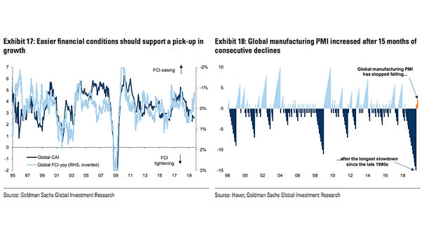
The Performance of “Deflation Assets” vs. “Inflation Assets”

The Performance of “Deflation Assets” vs. “Inflation Assets” Interesting chart showing the performance of “Deflation Asset” vs. “Inflation Assets” since 1960. “Deflation Assets”: Government Bonds, US Investment Grade, S&P 500, US Consumer Discretionary, Growth and US High Yield “Inflation Assets”: TIPS, EAFE, US Banks, Value and Cash Image: BofA Merrill Lynch

China Imports Lead World GDP

China Imports Lead World GDP This chart shows that China imports is a key factor of global growth, and clearly lead world GDP. Image: Oxford Economics, Macrobond

Number of DM and EM Central Banks Easing Each Month

Number of DM and EM Central Banks Easing Each Month Currently, most of the world’s central banks are easing, to boost money supply in the economy and stimulate economic growth. Image: J.P. Morgan

Year to Date Performance

Year to Date Performance Nice chart showing that REITs, large growth, S&P 500, gold and bonds perform best, through September. Image: Fidelity Investments

U.S. ISM Composite Index and U.S. Real GDP

U.S. ISM Composite Index and U.S. Real GDP This chart shows the good correlation between the ISM Composite Index (services + manufacturing) and U.S. real GDP. What about U.S. GDP growth in 2020? Image: Deutsche Bank Global Research

U.S. GDP vs. Global GDP

U.S. GDP vs. Global GDP The chart suggests that global growth has led U.S. growth this business cycle. And it also shows the high correlation between U.S. GDP and Global GDP. Image: Cantor Fitzgerald