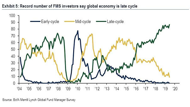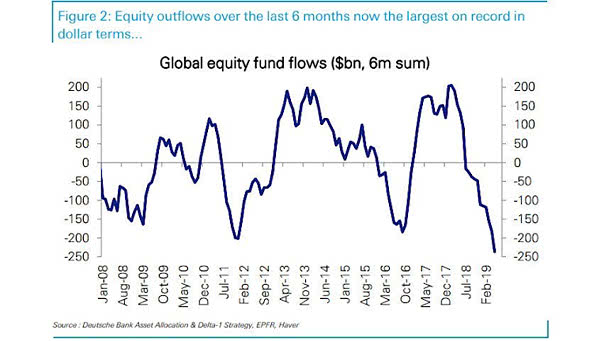
Global Equity Fund Flows
Global Equity Fund Flows This great chart from Deutsche Bank shows that equity outflows over the last 6 months are now the largest on record. In 2011 and 2016, it was similar and equities rose significantly. Image: Deutsche Bank