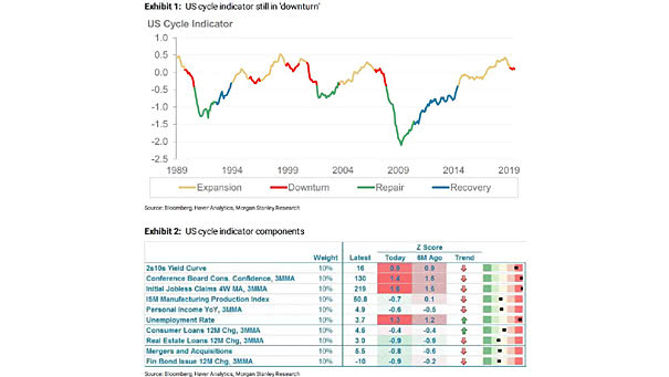
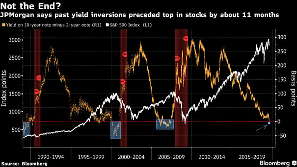
U.S. Business Cycle Indicator

U.S. Business Cycle Indicator The Morgan Stanley’s cyclical indicator is still in “downturn.” The entry into the “downturn” phase suggests lower returns for stocks and risky assets. Image: Morgan Stanley Research

First, Middle, Final Years of S&P 500 Bull Markets since 1975

First, Middle, Final Years of S&P 500 Bull Markets since 1975 The chart shows that the S&P 500 has generated a 26.9% return on average, in the final years of bull markets since 1975, excluding the current bull market. You may also like “Equity Market Performance Around Bear Markets.” Image: Legg Mason

U.S. Equities and The World: Earnings Growth vs. Multiple Expansion

U.S. Equities and The World: Earnings Growth vs. Multiple Expansion Since the 2009 low, the strong performance of the U.S. markets comes from earnings growth (73%) and multiple expansion (27%). You may also like “S&P 500 Return: Earnings Growth vs. Multiple Expansion.” Image: Goldman Sachs Global Investment Research

S&P 500 vs. U.S. Economic Surprises

S&P 500 vs. U.S. Economic Surprises This chart shows the large divergence between the S&P 500 Total Return and the U.S. economic surprise. You may also like “S&P 500 at Risk of a 10% Correction.” Image: Nordea and Macrobond

U.S. Equity Market Performance

U.S. Equity Market Performance since 1914 Excellent comparison between real (adjusted for inflation) and nominal returns on U.S. equities. Image: Saxo Bank

Equity Market Performance Around Bear Markets

Equity Market Performance Around Bear Markets Interesting chart showing the average return before and after equity market peaks from 1945 to 2018. You may also like “First, Middle, Final Years of S&P 500 Bull Markets since 1975.” Image: J.P. Morgan Asset Management

Dow Jones Transportation Average vs. S&P 500

Dow Jones Transportation Average vs. S&P 500 This interesting chart suggests that the Dow Jones Transportation Average underperforms in secular bull markets. Actually, the S&P 500 had higher returns when the Dow Jones Transportation Average experienced negative momentum. Image: Oppenheimer & Co.

S&P 500 and Recession Probability

S&P 500 and Recession Probability Great chart showing twelve Fed easing cycles since the 1950s, including the recession probability and the average return of the S&P 500 Index. Image: Fidelity Investments

MSCI ACWI ex-U.S. and S&P 500 Index

MSCI ACWI ex-U.S. and S&P 500 Index U.S. equities have significantly outperformed the rest of the world in recent years, but this has not always been the case. You may also like “Trailing 12-month Return Differential between U.S. and non-U.S. Stocks.” Image: ClearBridge Investments